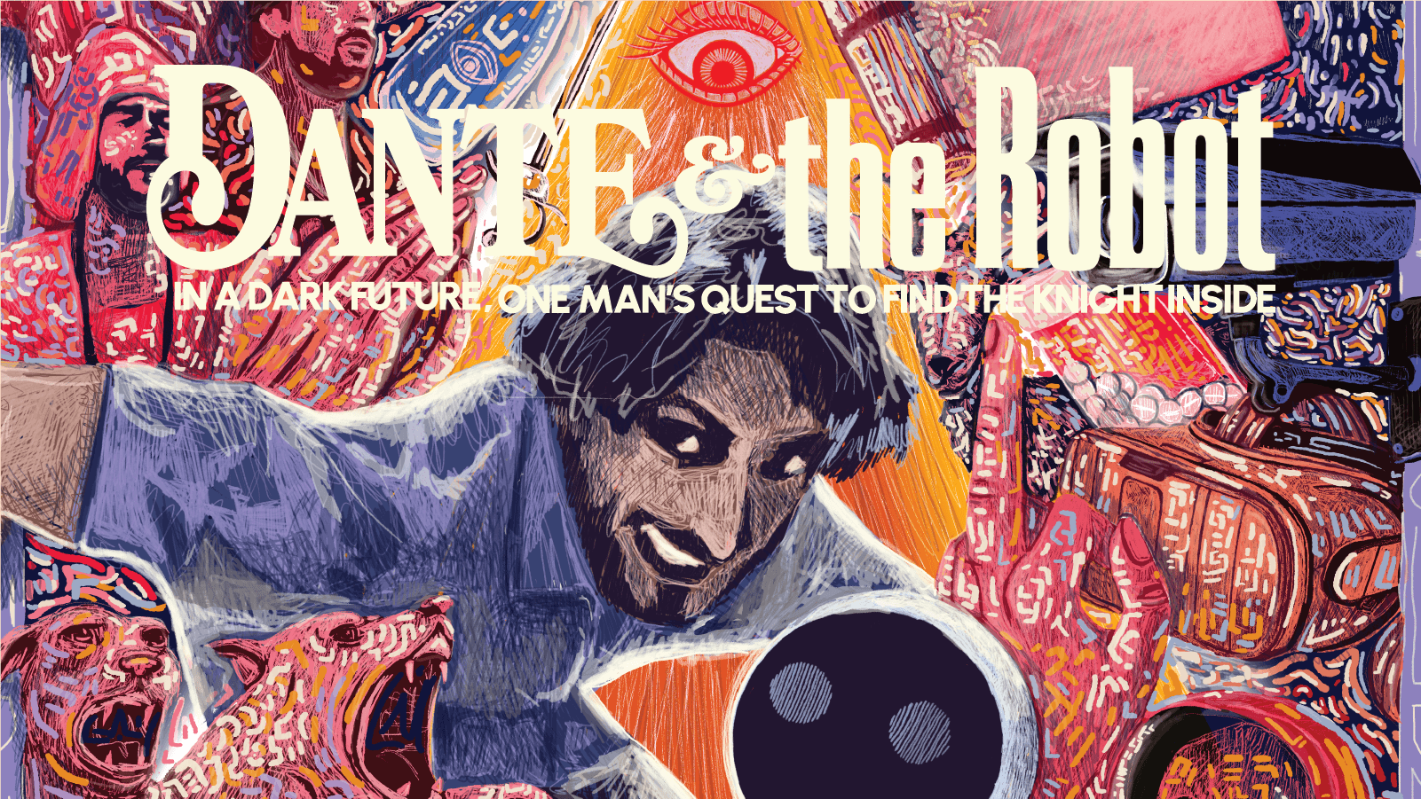
DANTE AND THE ROBOT
Alone in his miserable bedsit in a busy, bustling metropolis, Dante’s only companion is a house robot named She-bot. Trapped in an unfulfilling job, he attempts to escape through his writing, imagining his life as a Spanish knight on a quest with his French squire, battling monsters and travelling epic landscapes. Gradually, it becomes harder to tell what’s real and what isn’t.
WHAT I DELIVERED
WHAT I DELIVERED
Hand rendered illustration
Custom font creation
Poster and flyer design
Programme thumbnail design
Web banners
T-shirt design
Artworking for print
Print order
Hand rendered illustration
Custom font creation
Poster and flyer design
Programme thumbnail design
Web banners
T-shirt design
Artworking for print
Print order
WHAT I DELIVERED
Hand rendered illustration
Custom font creation
Poster and flyer design
Programme thumbnail design
Web banners
T-shirt design
Artworking for print
Print order
PROJECT OVERVIEW
PROJECT OVERVIEW
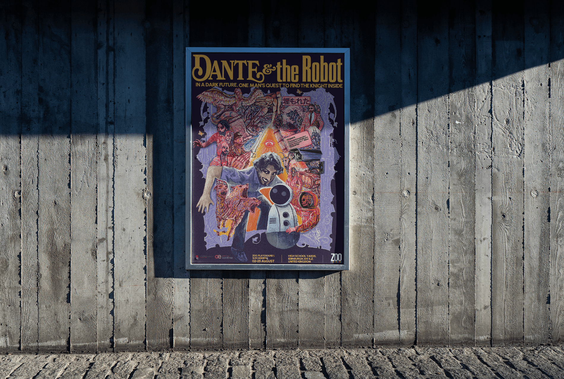
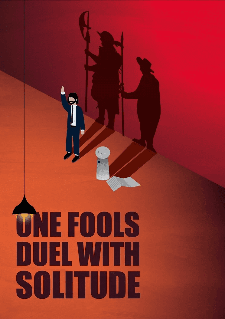
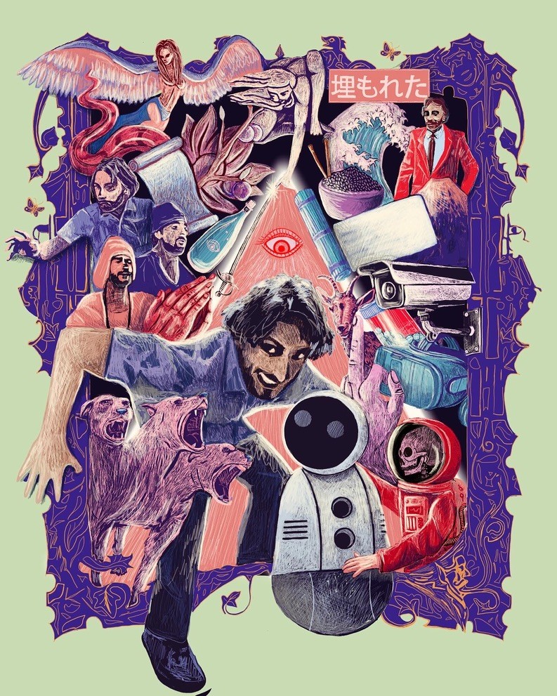
‘Dante and the Robot’ is a one man show, first publicly performed in London before making its way to the Edinburgh Fringe, 2024. Through hand rendered illustrations, bold colour choices and design that lures audiences in with its storytelling, this poster catches the eye, even in a sea of others.
‘Dante and the Robot’ is a one man show, first publicly performed in London before making its way to the Edinburgh Fringe, 2024. Through hand rendered illustrations, bold colour choices and design that lures audiences in with its storytelling, this poster catches the eye, even in a sea of others.
‘Dante and the Robot’ is a one man show, first publicly performed in London before making its way to the Edinburgh Fringe, 2024. Through hand rendered illustrations, bold colour choices and design that lures audiences in with its storytelling, this poster catches the eye, even in a sea of others.
PROJECT OVERVIEW
‘Dante and the Robot’ is a one man show, first publicly performed in London before making its way to the Edinburgh Fringe, 2024. Through hand rendered illustrations, bold colour choices and design that lures audiences in with its storytelling, this poster catches the eye, even in a sea of others.
THE CONCEPT
THE CONCEPT
The key to this particular project was getting to grips the numerous facets and layers within the play and connecting these with a vision that fluctuated as the client continued to develop the show and make new discoveries of their own.
The initial workshop led to several different routes of inspiration, but what stuck the most was the idea of contrast. The play follows one man, Dante, and his robot companion, She-bot, as he battles with reality and fantasy, caught in the middle of the two worlds clashing. I wanted to bring these two worlds together in the design, illustrating the peculiar mix of historical fantasy and a sci-fi dystopian future.
THE CONCEPT
The key to this particular project was getting to grips the numerous facets and layers within the play and connecting these with a vision that fluctuated as the client continued to develop the show and make new discoveries of their own.
The initial workshop led to several different routes of inspiration, but what stuck the most was the idea of contrast. The play follows one man, Dante, and his robot companion, She-bot, as he battles with reality and fantasy, caught in the middle of the two worlds clashing. I wanted to bring these two worlds together in the design, illustrating the peculiar mix of historical fantasy and a sci-fi dystopian future.
THE DESIGN
THE DESIGN
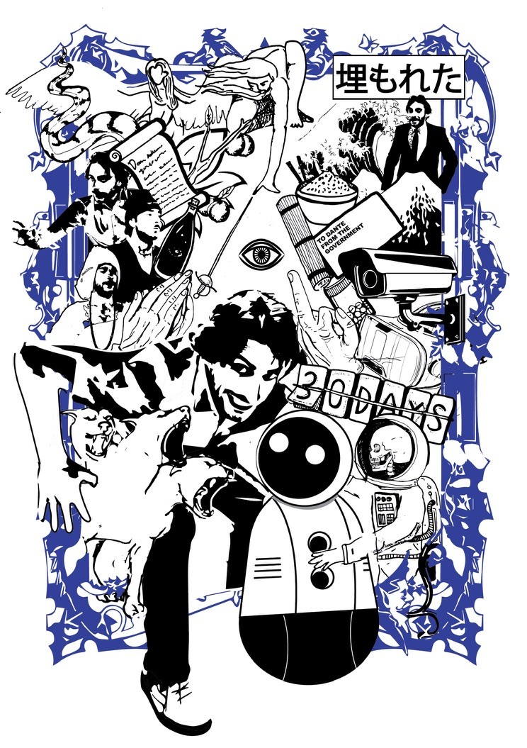
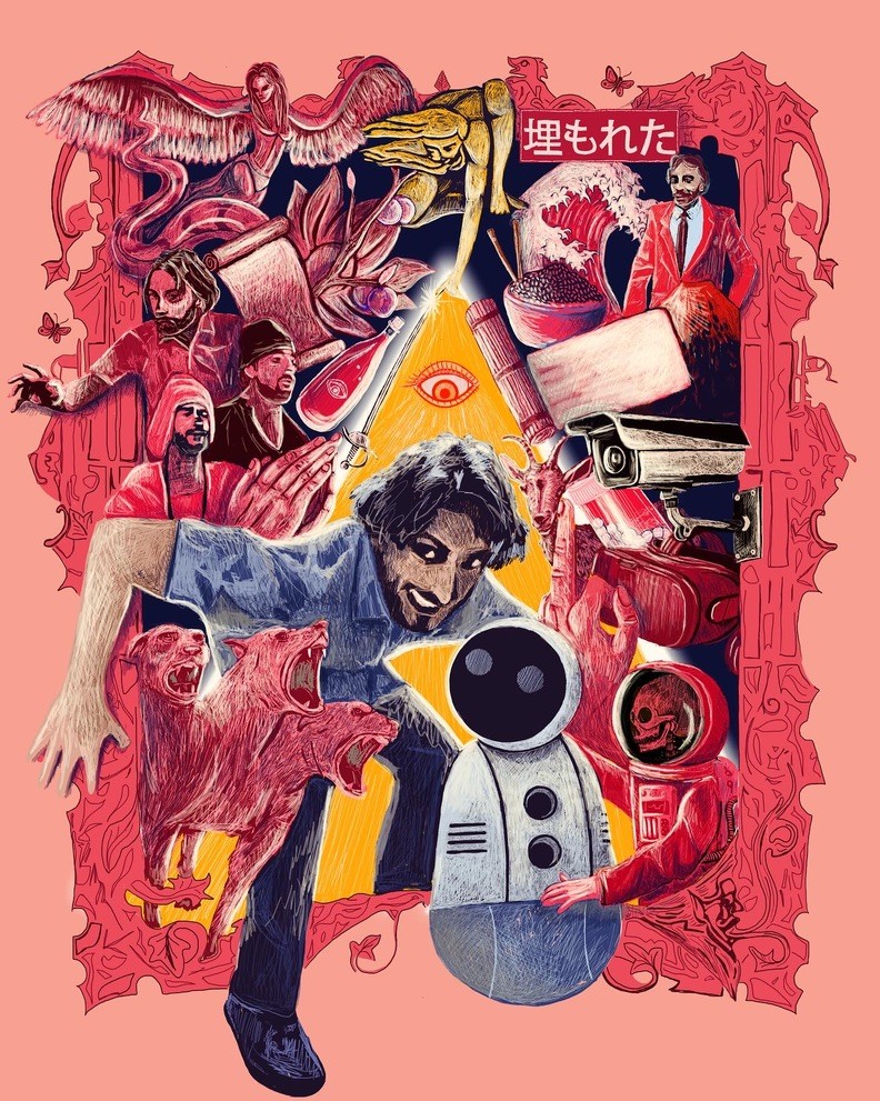
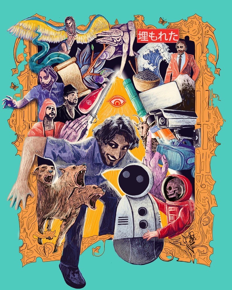
The design ended up taking a very different route from where those early chats had lead us. The client and I connected over a shared love of skateboarding, which we realised was the perfect source of inspiration for this project. I drew on the sense of rebellion that is typical to graphics associated with skateboarding to create a design that gives the middle finger to the system, just like Dante does.
I was inspired by retro sci-fi posters from the 70s and 80s and skate and surf graphics from the likes of Thrasher and Stussy. The poster brings together a cacophony of characters and images that exist within the play and uses them to accentuate Dante’s rebellion against the social norms of his dystopian times.
THE DESIGN
The design ended up taking a very different route from where those early chats had lead us. The client and I connected over a shared love of skateboarding, which we realised was the perfect source of inspiration for this project. I drew on the sense of rebellion that is typical to graphics associated with skateboarding to create a design that gives the middle finger to the system, just like Dante does.
I was inspired by retro sci-fi posters from the 70s and 80s and skate and surf graphics from the likes of Thrasher and Stussy. The poster brings together a cacophony of characters and images that exist within the play and uses them to accentuate Dante’s rebellion against the social norms of his dystopian times.
THE EXECUTION
THE EXECUTION
The illustration was done in a painterly style, which typically creates difficulties when it comes to making changes. By setting up the file with meticulous order, I was able to separate elements out, creating more flexibility later down the line.
I supplied several colour iterations of the final design, before finally adding a layer of glyphs that blur the illustrated elements together, driving home the themes of reality vs fantasy and of worlds colliding.
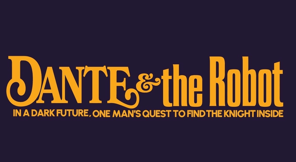
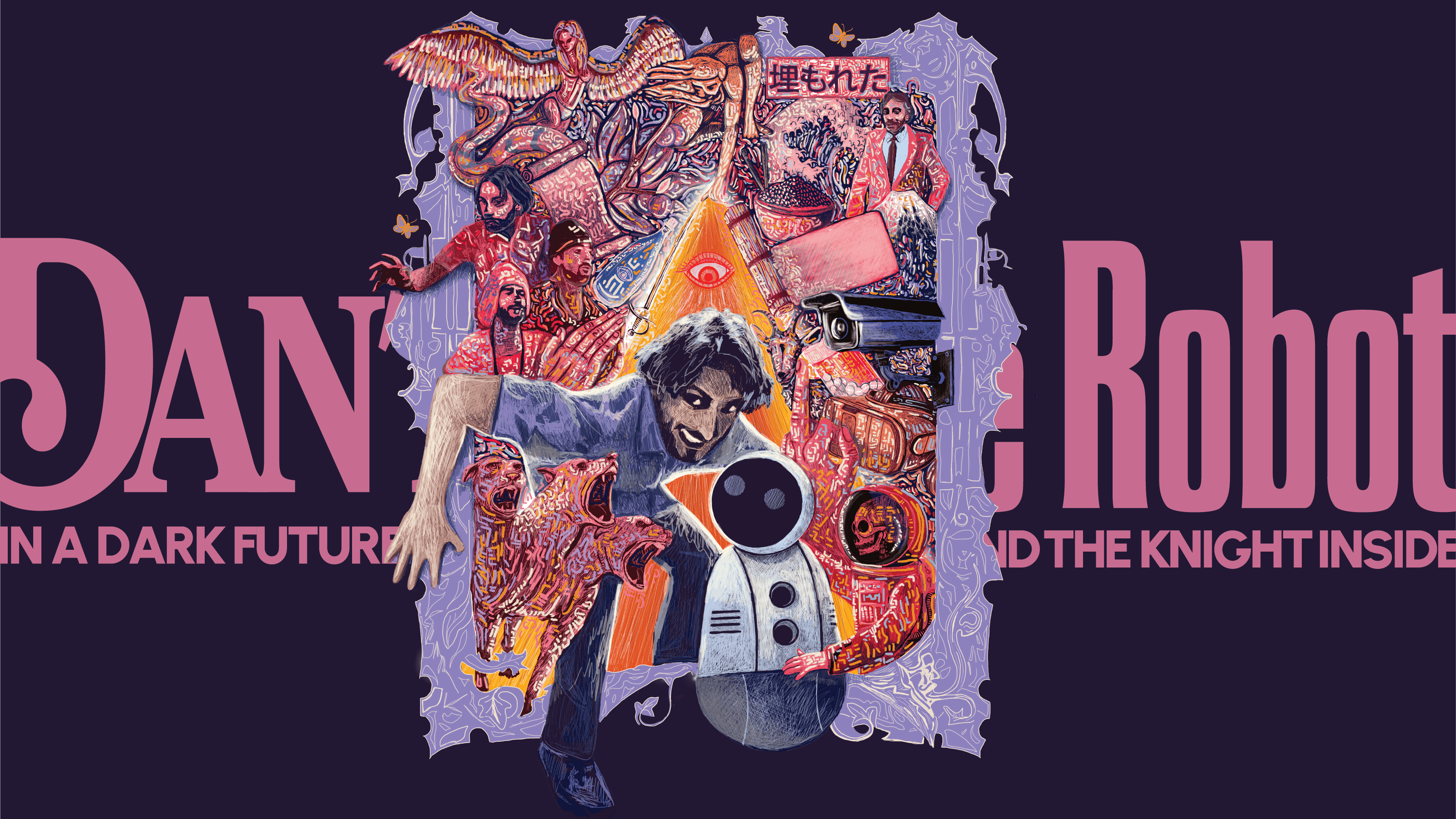
The title consists of a custom word marque which can be used across all other marketing and communications for the show. Alongside the poster, I delivered a two-page flyer, a web banner and a thumbnail.
The illustration was done in a painterly style, which typically creates difficulties when it comes to making changes. By setting up the file with meticulous order, I was able to separate elements out, creating more flexibility later down the line.
I supplied several colour iterations of the final design, before finally adding a layer of glyphs that blur the illustrated elements together, driving home the themes of reality vs fantasy and of worlds colliding.
The title consists of a custom word marque which can be used across all other marketing and communications for the show. Alongside the poster, I delivered a two-page flyer, a web banner and a thumbnail.
THE EXECUTION
The illustration was done in a painterly style, which typically creates difficulties when it comes to making changes. By setting up the file with meticulous order, I was able to separate elements out, creating more flexibility later down the line.
I supplied several colour iterations of the final design, before finally adding a layer of glyphs that blur the illustrated elements together, driving home the themes of reality vs fantasy and of worlds colliding.
The title consists of a custom word marque which can be used across all other marketing and communications for the show. Alongside the poster, I delivered a two-page flyer, a web banner and a thumbnail.
©2024 TOBY WOOD
GO BACK TO TOP
©2024 TOBY WOOD
GO BACK TO TOP