etal. COMMS
et al. are a PR and COMMS AGENCY start-up. The owners Alain and sam found the current parameters given to marketing projects to understand the success of the project didn't really tell the full story. They wanted their agency to push the boundaries and reveal results based successes rather than predicted goals.
WHAT I DELIVERED
WHAT I DELIVERED
Logo Design
Accompanying Graphics
Font selection and type treatment
colour palette
Web banners
social media Graphics
Logo Design
Accompanying Graphics
Font selection and type treatment
colour palette
Web banners
social media Graphics
WHAT I DELIVERED
Logo Design
Accompanying Graphics
Font selection and type treatment
colour palette
Web banners
social media Graphics
PROJECT OVERVIEW
PROJECT OVERVIEW
et al. was born from the belief that the traditional agency model is broken. Too often, clients find their accounts under-resourced and their press coverage lacking.
et al. was born from the belief that the traditional agency model is broken. Too often, clients find their accounts under-resourced and their press coverage lacking.
et al. was born from the belief that the traditional agency model is broken. Too often, clients find their accounts under-resourced and their press coverage lacking.
PROJECT OVERVIEW
et al. was born from the belief that the traditional agency model is broken. Too often, clients find their accounts under-resourced and their press coverage lacking.
THE CONCEPT
THE CONCEPT
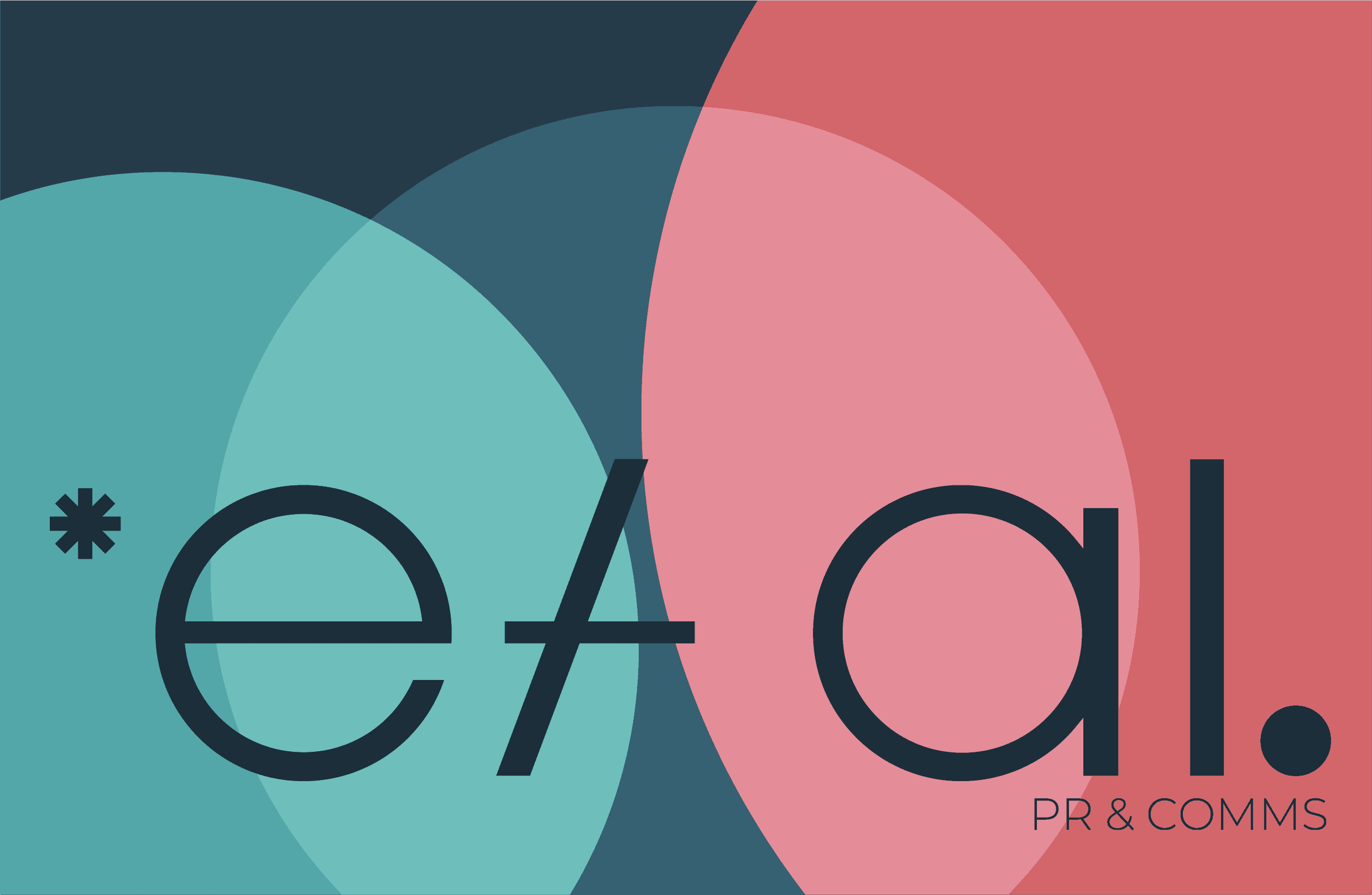
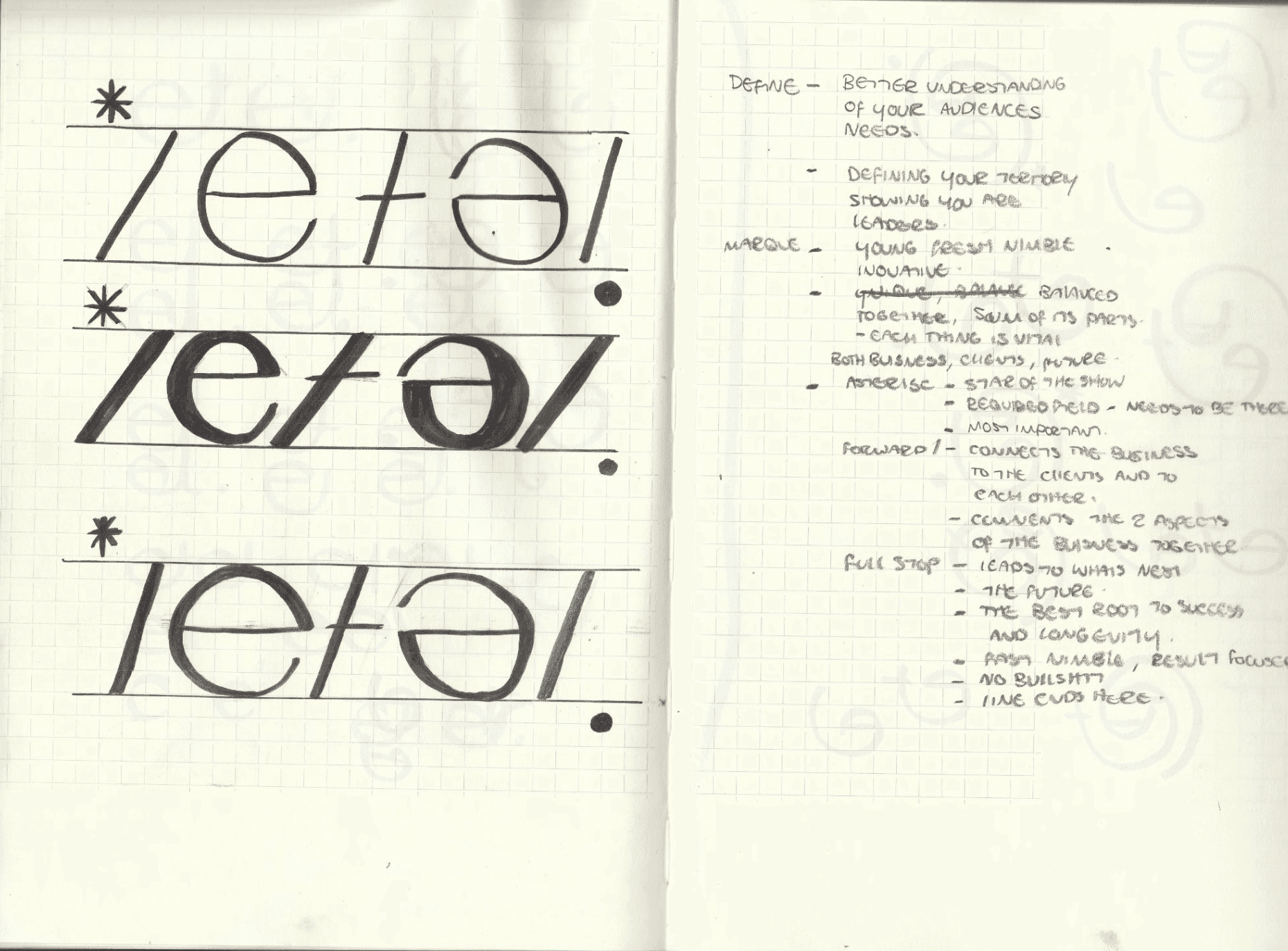
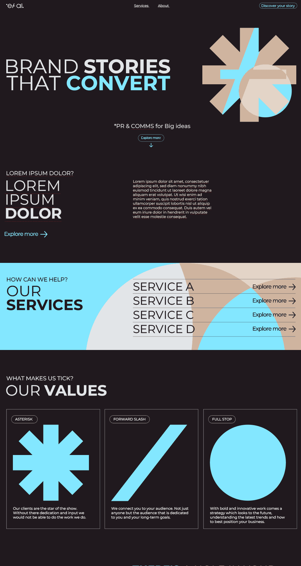
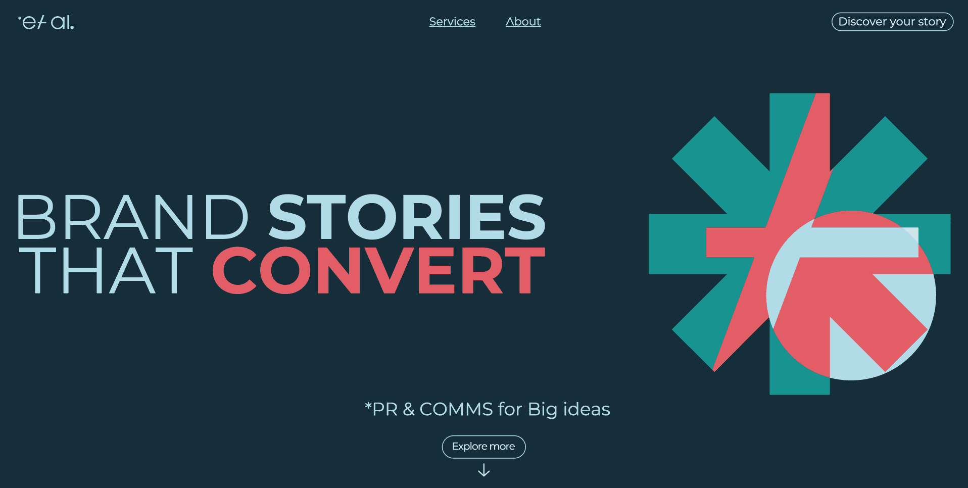
The key to this particular project was managing client expectations and trying to get across the different facets of what a brand is and what can be achieved. The initial conversations led to a large spread of outputs, but the key was understanding the nature of the client. they are a young start up, with hopes to be a bold statement amongst their peers. At the same time the work which inspires them is incredibly minimalistic. To try and marry these two worlds I went for simplistic forms that could be used flexibly.
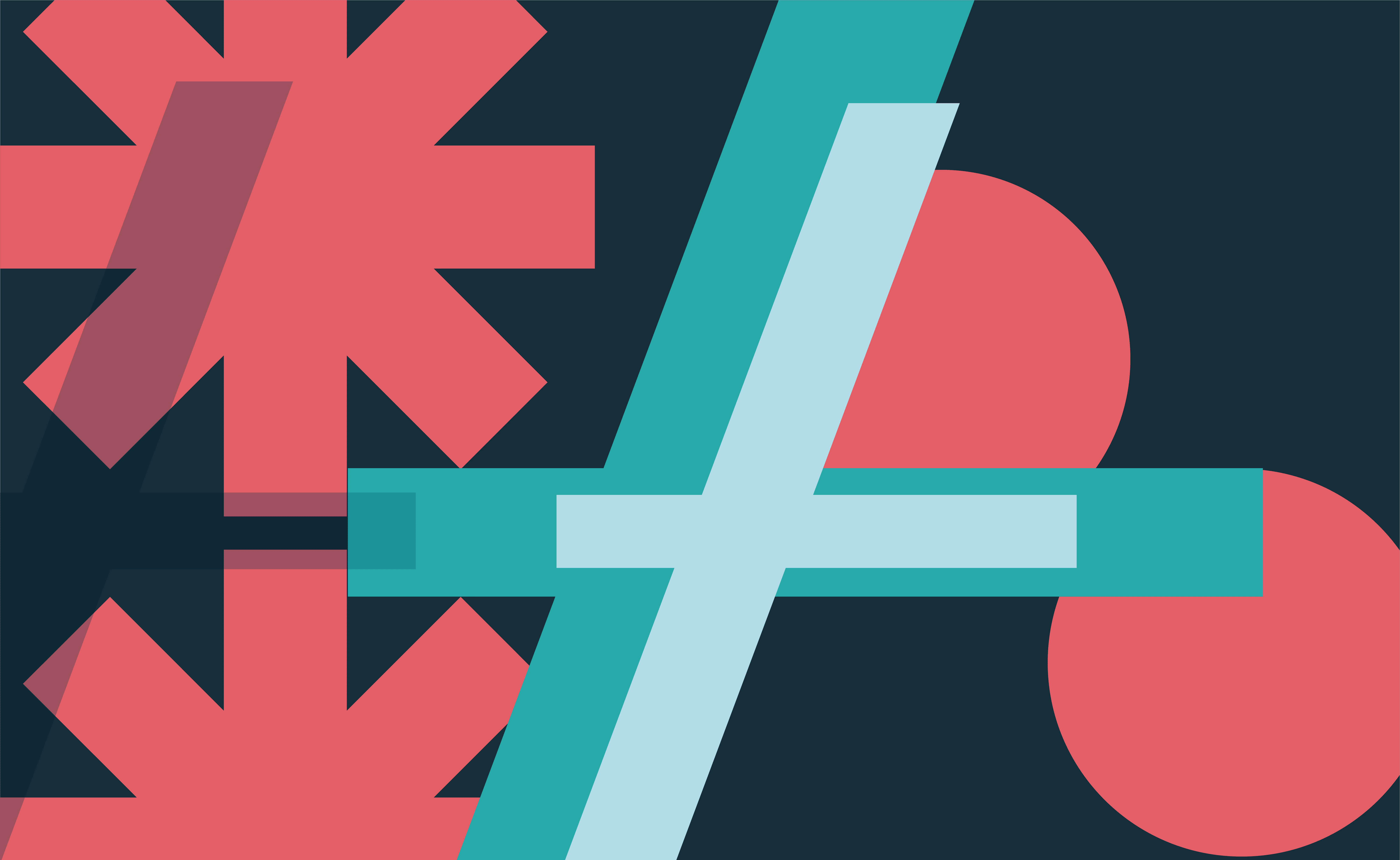
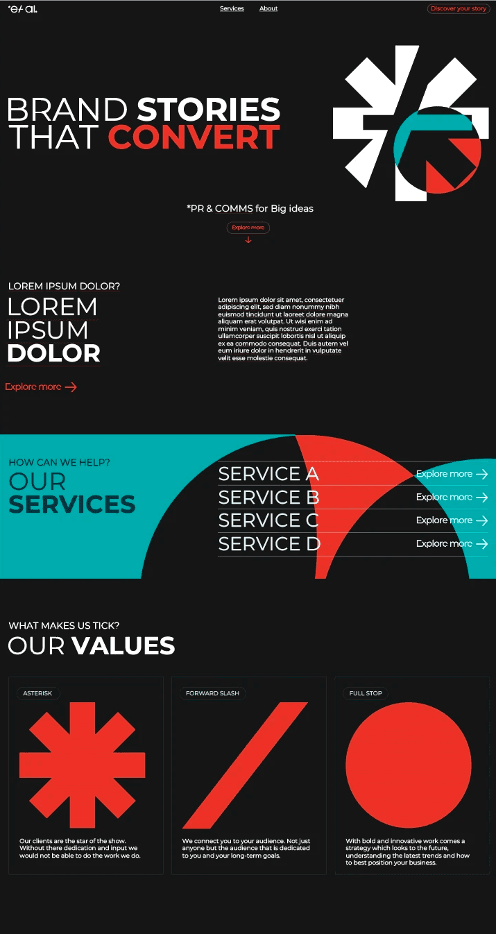
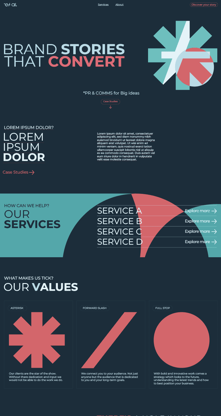
After confirming the deign of the word mark we moved onto colour. I supplied the client lots of different colour pallets as we really wanted to set them apart in what is a very crowded space.
The key to this particular project was managing client expectations and trying to get across the different facets of what a brand is and what can be achieved. The initial conversations led to a large spread of outputs, but the key was understanding the nature of the client. they are a young start up, with hopes to be a bold statement amongst their peers. At the same time the work which inspires them is incredibly minimalistic. To try and marry these two worlds I went for simplistic forms that could be used flexibly.
After confirming the deign of the word mark we moved onto colour. I supplied the client lots of different colour pallets as we really wanted to set them apart in what is a very crowded space.
THE CONCEPT
The key to this particular project was managing client expectations and trying to get across the different facets of what a brand is and what can be achieved. The initial conversations led to a large spread of outputs, but the key was understanding the nature of the client. they are a young start up, with hopes to be a bold statement amongst their peers. At the same time the work which inspires them is incredibly minimalistic. To try and marry these two worlds I went for simplistic forms that could be used flexibly.
After confirming the deign of the word mark we moved onto colour. I supplied the client lots of different colour pallets as we really wanted to set them apart in what is a very crowded space.
THE DESIGN
THE DESIGN
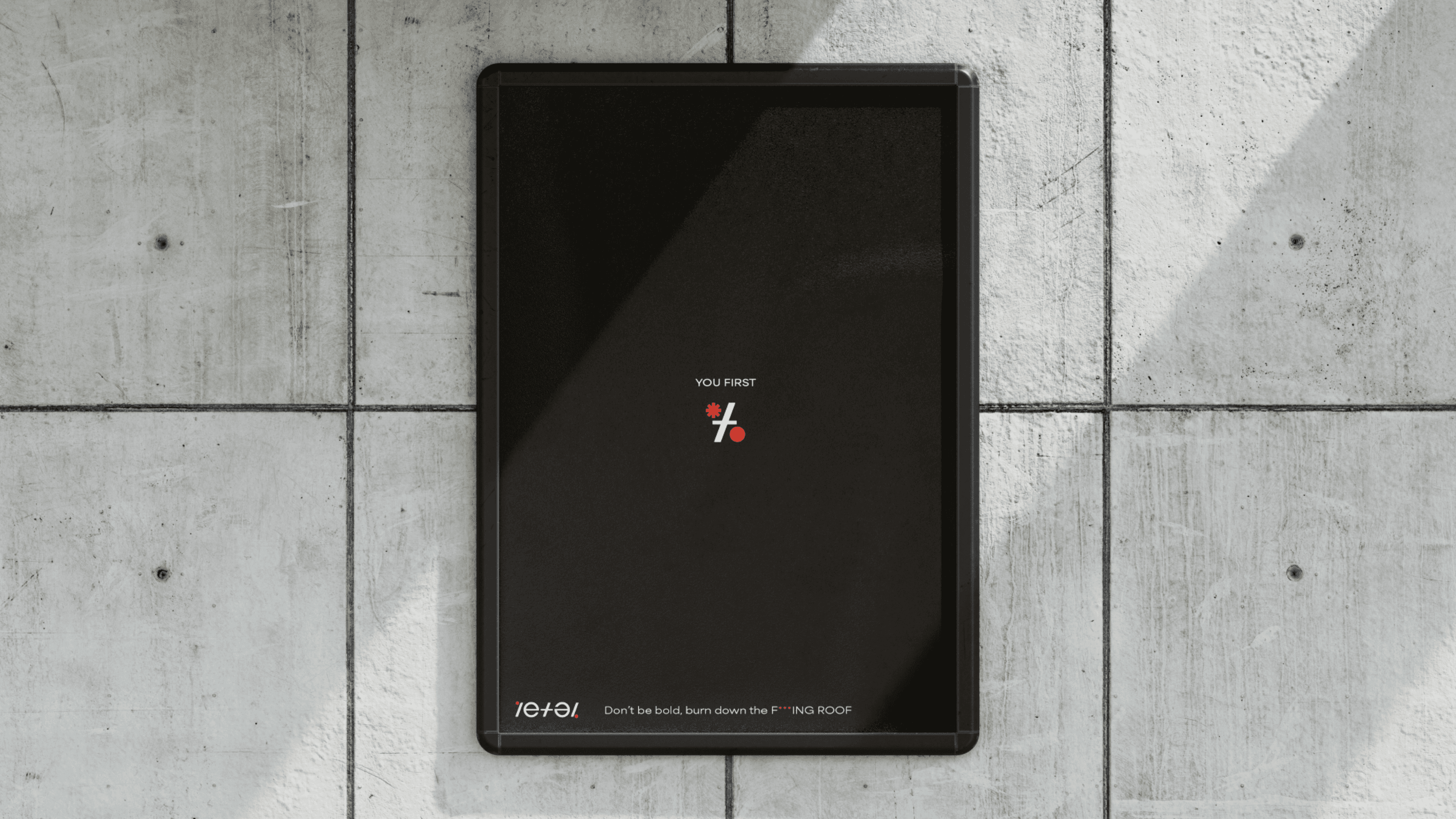
The final brand took many forms before we reached the final design. We discussed multiple options for the colour and found it best to use a homepage design in order for us to be able communicate effectively what worked. This project challenged me but i am happy to see how it exists within the space. Setting my client apart, being bold.
The final brand took many forms before we reached the final design. We discussed multiple options for the colour and found it best to use a homepage design in order for us to be able communicate effectively what worked. This project challenged me but i am happy to see how it exists within the space. Setting my client apart, being bold.
THE DESIGN
The final brand took many forms before we reached the final design. We discussed multiple options for the colour and found it best to use a homepage design in order for us to be able communicate effectively what worked. This project challenged me but i am happy to see how it exists within the space. Setting my client apart, being bold.
THE EXECUTION
THE EXECUTION
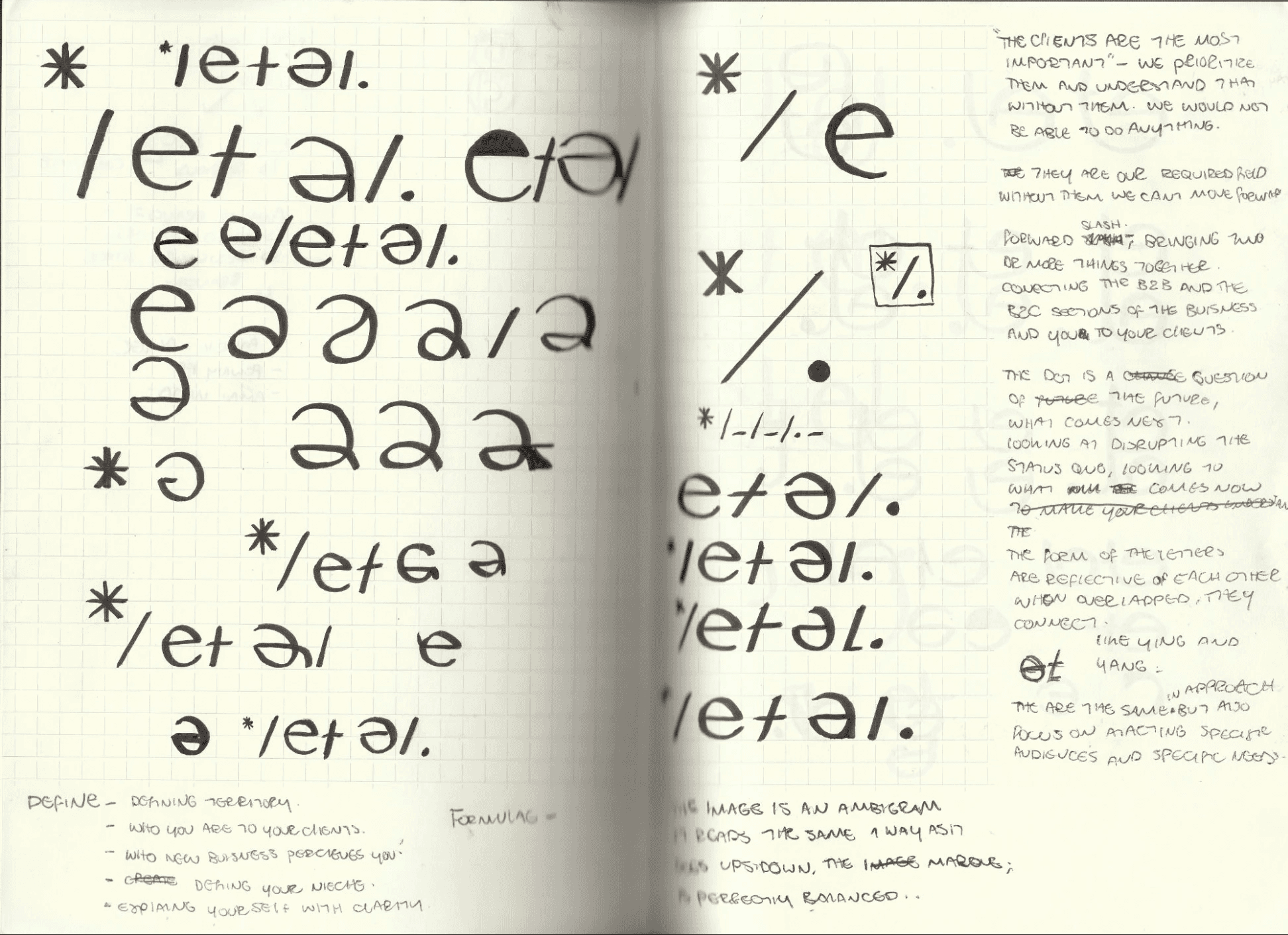
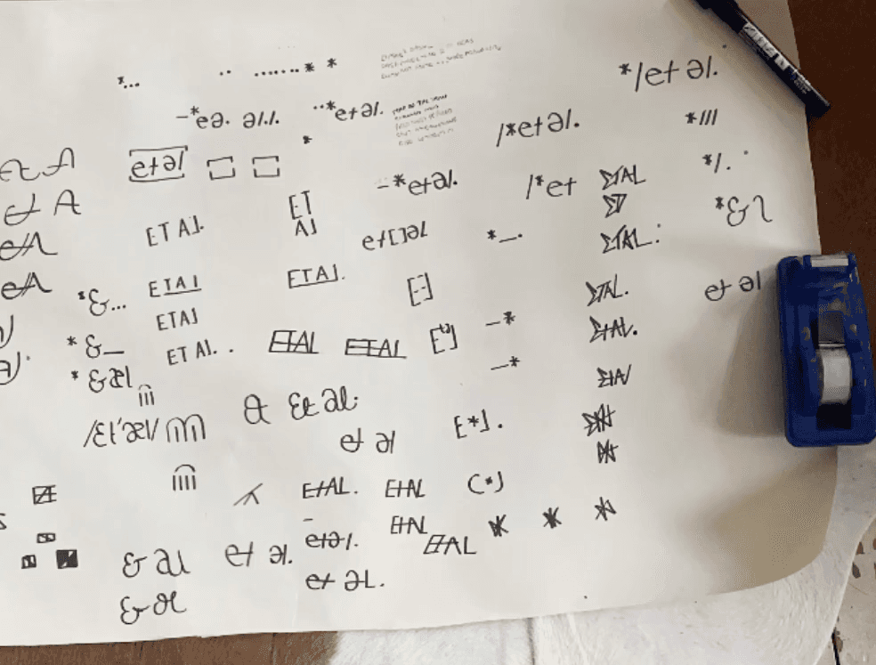
The logo and the graphics where initially drawn by hand and then digitised. I find that it is so important to try and focus the main brunt of the initial design phase in sketches and hand rendered techniques. It allows the nuances of the colour, weight to be ignored at such an early stage. sometimes i see logos being delivered in full and i feel that this doesn't incorporate the client enough when ultimately the most important thing is getting the client on board.
The logo and the graphics where initially drawn by hand and then digitised. I find that it is so important to try and focus the main brunt of the initial design phase in sketches and hand rendered techniques. It allows the nuances of the colour, weight to be ignored at such an early stage. sometimes i see logos being delivered in full and i feel that this doesn't incorporate the client enough when ultimately the most important thing is getting the client on board.
THE EXECUTION
The logo and the graphics where initially drawn by hand and then digitised. I find that it is so important to try and focus the main brunt of the initial design phase in sketches and hand rendered techniques. It allows the nuances of the colour, weight to be ignored at such an early stage. sometimes i see logos being delivered in full and i feel that this doesn't incorporate the client enough when ultimately the most important thing is getting the client on board.
©2024 TOBY WOOD
GO BACK TO TOP
©2024 TOBY WOOD
GO BACK TO TOP