Centre for neurorehabilitation
The UCL CNR’s vision is for all patients with neurodisability to achieve the best possible long-term physical, psychological, and emotional recovery.
Centre for neurorehabilitation
The UCL CNR’s vision is for all patients with neurodisability to achieve the best possible long-term physical, psychological, and emotional recovery.
Centre for neurorehabilitation
The UCL CNR’s vision is for all patients with neurodisability to achieve the best possible long-term physical, psychological, and emotional recovery.
Centre for neurorehabilitation
The UCL CNR’s vision is for all patients with neurodisability to achieve the best possible long-term physical, psychological, and emotional recovery.
WHAT I DELIVERED
WHAT I DELIVERED
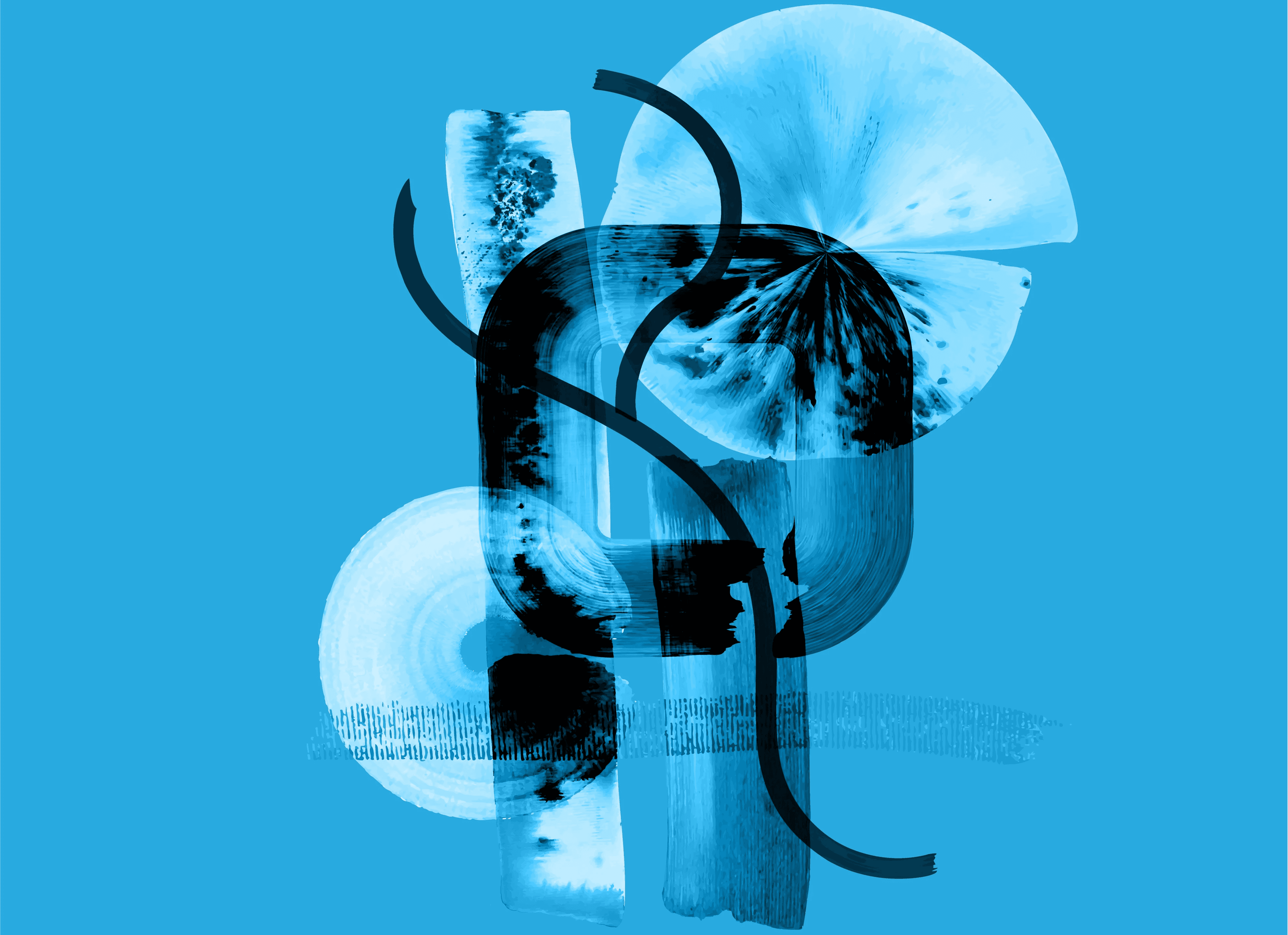
Visual identity
Toolkit of hand rendered brushstrokes
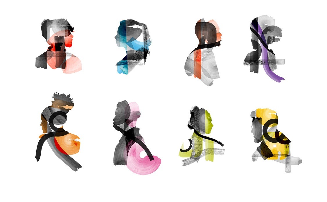
for digital applicationSelection of illustrated collages
Visual identity
Toolkit of hand rendered brushstrokes
for digital applicationSelection of illustrated collages
WHAT I DELIVERED
Visual identity
Toolkit of hand rendered brushstrokes
for digital applicationSelection of illustrated collages
PROJECT OVERVIEW
PROJECT OVERVIEW
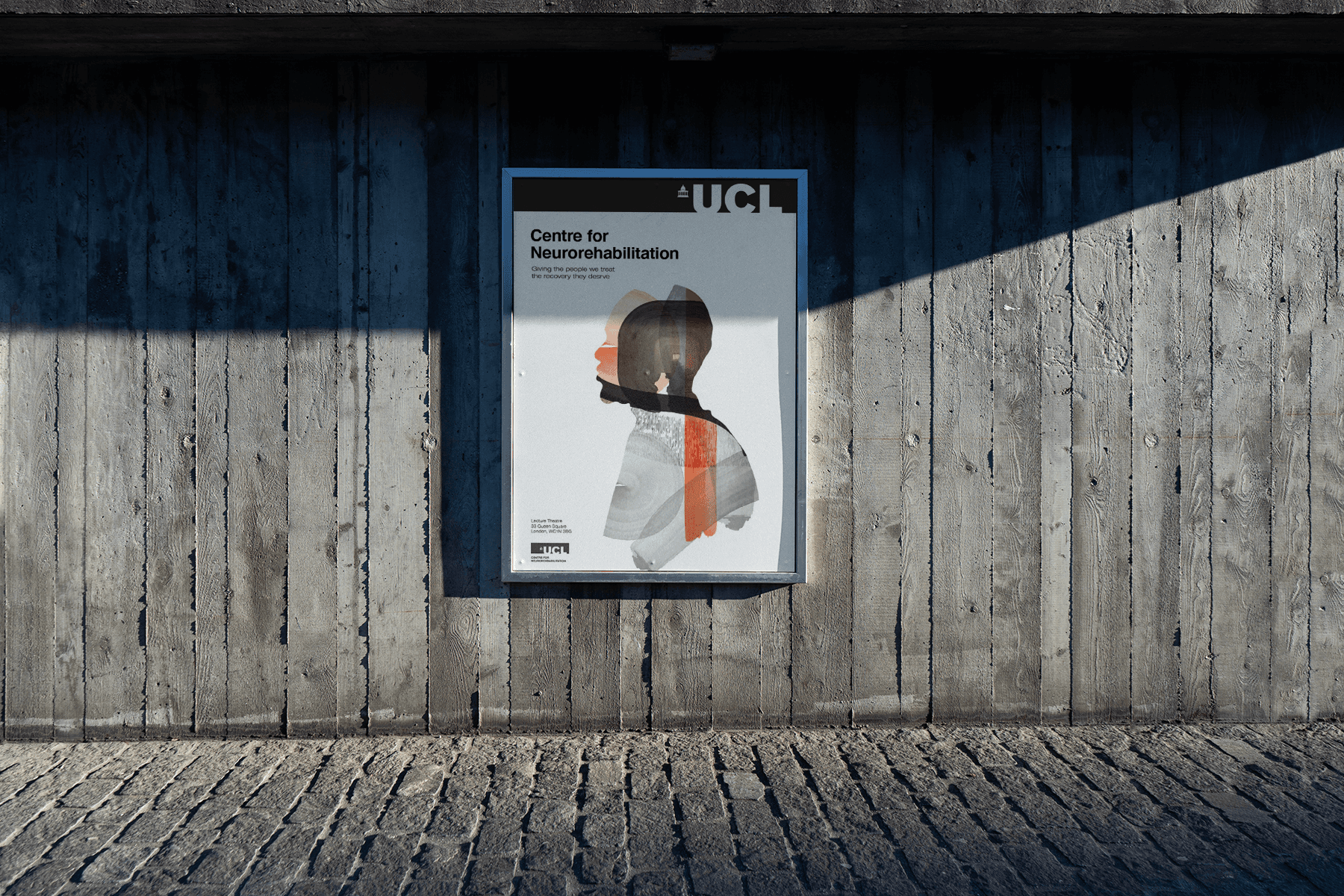
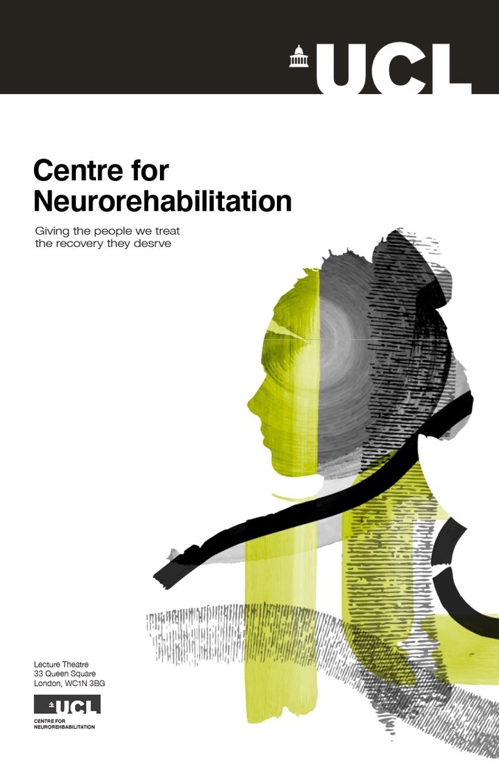
The Centre for Neurorehabilitation at Queen Square (CNR) brings together interdisciplinary research and innovation, clinical services, education and support to transform the lives of people living with neurodisability. The brief was to deliver a visual identity that resonated with a patient’s feelings when they first arrive at the centre and showcases the incredible work CNR do when helping piece back together the lives of people after they suffer severe neurological trauma.
The Centre for Neurorehabilitation at Queen Square (CNR) brings together interdisciplinary research and innovation, clinical services, education and support to transform the lives of people living with neurodisability. The brief was to deliver a visual identity that resonated with a patient’s feelings when they first arrive at the centre and showcases the incredible work CNR do when helping piece back together the lives of people after they suffer severe neurological trauma.
The Centre for Neurorehabilitation at Queen Square (CNR) brings together interdisciplinary research and innovation, clinical services, education and support to transform the lives of people living with neurodisability. The brief was to deliver a visual identity that resonated with a patient’s feelings when they first arrive at the centre and showcases the incredible work CNR do when helping piece back together the lives of people after they suffer severe neurological trauma.
PROJECT OVERVIEW
The Centre for Neurorehabilitation at Queen Square (CNR) brings together interdisciplinary research and innovation, clinical services, education and support to transform the lives of people living with neurodisability. The brief was to deliver a visual identity that resonated with a patient’s feelings when they first arrive at the centre and showcases the incredible work CNR do when helping piece back together the lives of people after they suffer severe neurological trauma.
THE CONCEPT
THE CONCEPT
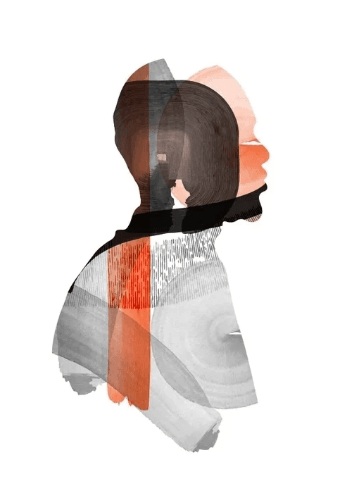
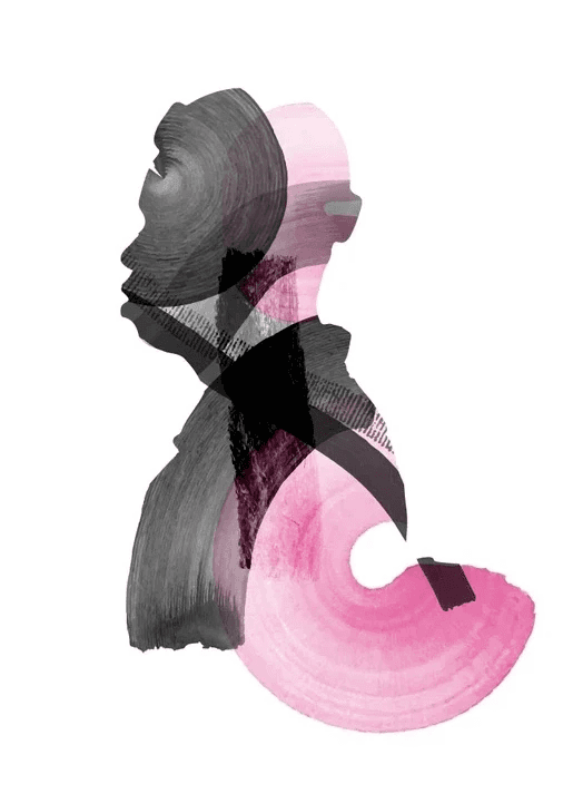
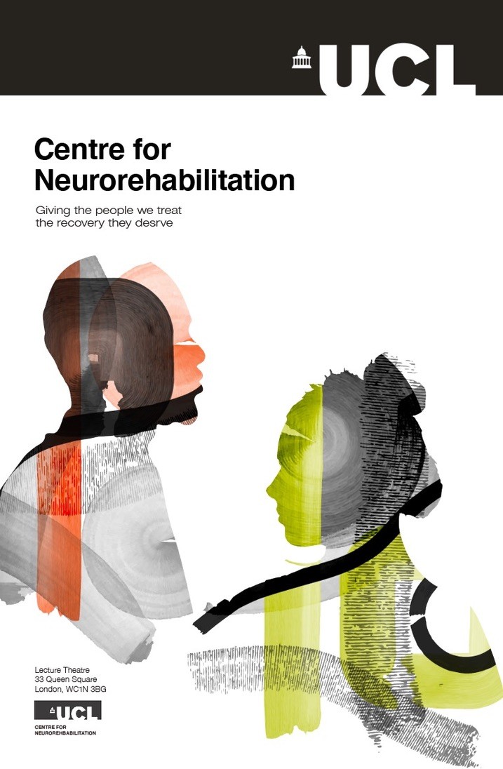
When patients first visit the CNR, many may be at one of the hardest points in their lives, feeling incomplete or less than their original selves. CNR are in the business of making people feel whole again. They help people rediscover parts of their lives that they thought were lost.
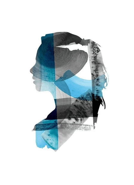
Collages are formed of many different parts that come together to create a new whole, so this was the perfect way to tell the story of CNR and their mission. The various textured brush strokes combine to form the silhouette of a person—a jigsaw made complete. Yet the hand rendered marks also serve as a reminder of how precious our mobility is, and how it can be taken so easily.
When patients first visit the CNR, many may be at one of the hardest points in their lives, feeling incomplete or less than their original selves. CNR are in the business of making people feel whole again. They help people rediscover parts of their lives that they thought were lost.
Collages are formed of many different parts that come together to create a new whole, so this was the perfect way to tell the story of CNR and their mission. The various textured brush strokes combine to form the silhouette of a person—a jigsaw made complete. Yet the hand rendered marks also serve as a reminder of how precious our mobility is, and how it can be taken so easily.
THE CONCEPT
When patients first visit the CNR, many may be at one of the hardest points in their lives, feeling incomplete or less than their original selves. CNR are in the business of making people feel whole again. They help people rediscover parts of their lives that they thought were lost.
Collages are formed of many different parts that come together to create a new whole, so this was the perfect way to tell the story of CNR and their mission. The various textured brush strokes combine to form the silhouette of a person—a jigsaw made complete. Yet the hand rendered marks also serve as a reminder of how precious our mobility is, and how it can be taken so easily.
THE DESIGN
THE DESIGN
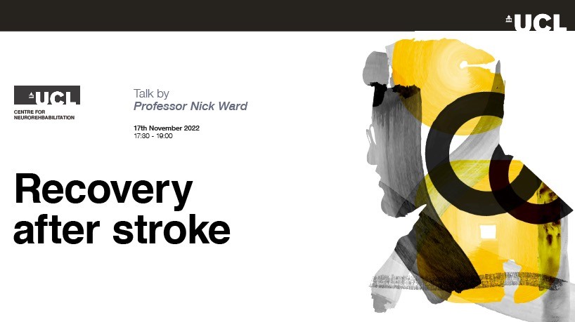
A large portion of CNR’s work is in physical therapy so bold brush strokes were used to immediately evoke a sense of movement. You imagine each mark being made on the page, the way it might feel in your hand as you manipulate the brush, reaching and swirling across the paper. This also makes the design feel human—the path traced by a tool across a page is tangible and familiar.
Despite the nature of the mediums I worked with, the client wanted the end products to feel calm and collected, to reassure patients of their expertise. Each mark made needed to be intentional, whilst still capturing the inner turmoil a patient might be feeling.
Each brushstroke can be used as part of a collage or as an individual graphic element, affording the brand flexibility for their designed assets to grow as the brand does.
THE DESIGN
A large portion of CNR’s work is in physical therapy so bold brush strokes were used to immediately evoke a sense of movement. You imagine each mark being made on the page, the way it might feel in your hand as you manipulate the brush, reaching and swirling across the paper. This also makes the design feel human—the path traced by a tool across a page is tangible and familiar.
Despite the nature of the mediums I worked with, the client wanted the end products to feel calm and collected, to reassure patients of their expertise. Each mark made needed to be intentional, whilst still capturing the inner turmoil a patient might be feeling.
Each brushstroke can be used as part of a collage or as an individual graphic element, affording the brand flexibility for their designed assets to grow as the brand does.
THE EXECUTION
THE EXECUTION
Beginning with experimentation in ink, graphite, charcoal and pigment powder, I created a series of textured brush strokes using hand rendered techniques. These were then digitalised as functioning brushes for use in developing the collages and the brand’s future visual assets. When making the collages, I opted for darker marks around the edges of the silhouettes to create a sense of depth.
This illustrative style provided CNR with a powerful visual identity that compels you to their work and echos the patients’ experiences at the CNR. The beauty of this illustrated design system is that you can create so many different combinations while maintaining brand consistency across multiple platforms.
THE EXECUTION
Beginning with experimentation in ink, graphite, charcoal and pigment powder, I created a series of textured brush strokes using hand rendered techniques. These were then digitalised as functioning brushes for use in developing the collages and the brand’s future visual assets. When making the collages, I opted for darker marks around the edges of the silhouettes to create a sense of depth.
This illustrative style provided CNR with a powerful visual identity that compels you to their work and echos the patients’ experiences at the CNR. The beauty of this illustrated design system is that you can create so many different combinations while maintaining brand consistency across multiple platforms.
©2024 TOBY WOOD
GO BACK TO TOP
©2024 TOBY WOOD
GO BACK TO TOP